the web became fat.
let's put it on a diet.
get rid of those burgers.
Meet Paradeiser.

Meet Paradeiser.

or just go with the flow
bower install Paradeiser
Share the love!
TweetNot only is the icon still not widely recognized and therfore a major usability flaw, it also hides all the links on the website for 3 damn lines.
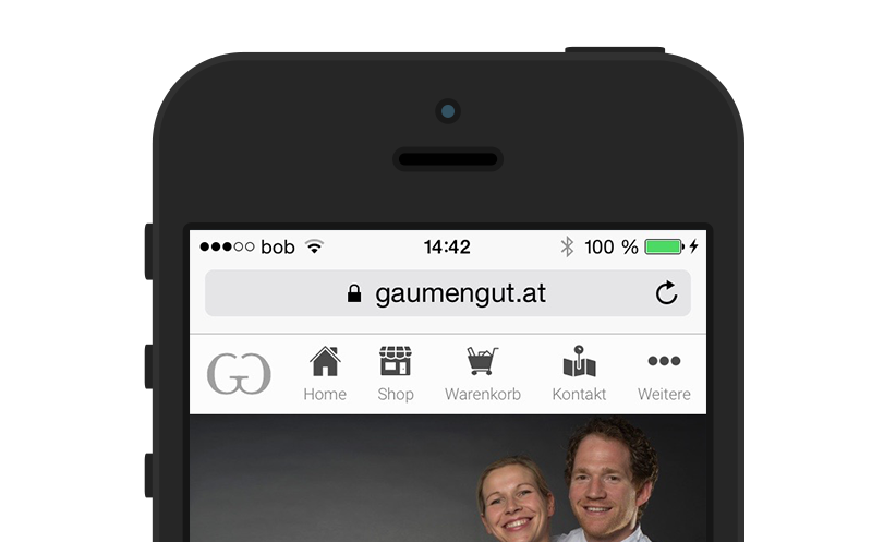
With Paradeiser you are forced to display 3-5 of your major links directly to the user, making it more appealing to click one of them for further information.
Examples of Paradeiser in usage:
With only 1.3kb gzipped in a single request Paradeiser is one of the easiest to implement navigations.
Forget handling with jQuery or Javascript. Paradeiser is CSS only. SCSS is available for customizations as well.
Yes, there is still a hamburger-like navigation implemented as well. You might want to put less important links like Terms and Conditions there. But since it resides next to other nav links the recognition is greatly improved.
Paradeiser is designed to be used on Mobile Screens as well as Desktops. To further improve your navigation hiding classes are here to use: Hide certain links on mobile and put them into the overflow and vice versa.
Although Paradeiser itself is usable without any JS at all, Headroom.js enhances its experience a lot by providing automatic hiding on scrolling, as you can see on this page. The implementation is fairly simple, be sure to check out the demo (Source Code) for an in-depth demo on this topic. Demo without Overflow (Source Code)
first load up the style into your html header (hosted by cdnjs)
<link rel="stylesheet" href="https://cdnjs.cloudflare.com/ajax/libs/paradeiser/0.4.2/min/paradeiser.min.css">
Or if you downloaded the css onto your own server
<link rel="stylesheet" href="paradeiser.min.css">
then paste in the menu itself
<nav class="paradeiser">
    <a href="#">
        <img src="logo.png" alt="Logo" class="paradeiser_logo">
    </a>
    <a href="#">
        <div class="paradeiser_icon_canvas">
            <img src="img/menu_home.svg" alt="Navigate to Home">
        </div>
        <span>Home</span>
    </a>
    <a href="#">
        <div class="paradeiser_icon_canvas">
            <img src="img/menu_shop.svg" alt="Navigate to Shop">
        </div>
        <span>Shop</span>
    </a>

    <!-- paste in as many links as you want -->

    <!-- and include the dropdown aswell -->
    <div class="paradeiser_dropdown">
        <a href="#paradeiser-more" id="paradeiser-dropdown">
            <div class="paradeiser_icon_canvas">
                <img src="img/menu_overflow.svg" alt="">
            </div>
            <span>More</span>
        </a>
        <ul class="paradeiser_children" id="paradeiser-more">
            <li><a href="#">Terms of Service</a></li>
            <li><a href="#">About Us</a></li>
            <li><a href="#">Yolo</a></li>
            <li class="paradeiser-hidden-desktop"><a href="#">Hidden on desktop</a></li>
            <li class="paradeiser-hidden-tablet"><a href="#">Hidden on tablet</a></li>
            <li class="paradeiser-hidden-phone"><a href="#">Hidden on phone</a></li>
            <li id="greybox"><a href="#!"></a></li>
        </ul>
    </div>
</nav>
<script src="//cdnjs.cloudflare.com/ajax/libs/headroom/0.7.0/headroom.min.js"></script>
And then
    // enabling to open the overflow menu as the pure css link
    // would toggle a scroll and therefore hide the menu
    document.getElementById("paradeiser-dropdown").addEventListener("click", function(event){
        // stopping the scroll
        event.preventDefault();
        // toggling the class
        document.getElementById("paradeiser-more").classList.toggle("open");
    });

    // hide the menu on click onto greybox
    document.getElementById("greybox").addEventListener("click", function(event){
        // stopping the scroll
        event.preventDefault();
        // toggling the class
        document.getElementById("paradeiser-more").classList.remove("open");
    });

    // enabling headroom
    var myElement = document.querySelector(".paradeiser");
    var headroom  = new Headroom(myElement, {
        tolerance : 5,
        onUnpin : function() {
            document.getElementById("paradeiser-more").classList.remove("open");
        }
    });
    headroom.init();